In this companion text I'd like to explain the significance of, and the reason why, the photographic look of two totally different camera formats might be negligible, yet the look of the same capture format with different preparations can be utterly different, as is shown in Galleries 1 and 2 below.
GALLERY 1: Click to compare the same format
GALLERY 2: Click to compare different formats
The elusive thing that we call the photographic look is an abstract phenomenon. It's the aggregate perceptual experience that emerges from the sum of many smaller attributes that clue the eye.
So, the question is: can we as filmmakers identify, isolate and understand any of these underlying attributes so that we can manipulate them meaningfully for ourselves, or are we forever relegated to the status of shoppers; browsing for pre-packaged solutions and then wearing the badge of brand allegiance to the one we select.
"The longing for simplicity in the face of overwhelming complexity is as understandable as it is misguided" warns Mark C. Taylor. As artists, to put all of our faith in the illusory simplicity of bundled systems instead of understanding the analytic components that are the undeniable building blocks of the process is to give up our control and authorship. How has it come to be that we've taught ourselves that that nuanced and masterful creative authorship is as simple as choosing Coke versus Pepsi? Expertise requires more than simply memorizing (and then repeating) which of three or four prepackaged options is the best one.
The dominant narrative amongst imaging professionals has been that the camera-type is our figurative paint brush and it's necessarily responsible for a recognizable look that's visible in the final image. But the reality is that it is possible after image data has been collected by a camera to sculpt and craft the individual perceptual elements whose aggregate is that final photographic look.
As long as we're comparing high quality capture formats that get enough information for professional cinema (and not inferior acquisition devices like, say smartphone cameras), then whether we're talking about color rendition, apparent resolution, highlight rolloff, halation, or myriad other perceptual attributes, the substantial part of the perceptual look comes from the mathematical preparation of the image for display and not from the camera format.
This means that if we can identify the attributes that matter to us, we can control and sculpt them precisely and individually... regardless of camera type. The fact that we have a history of not trying to do much along these lines is not proof that it can't be done.
When it comes to the photographic look that has traditionally been attributed to merely selecting one of several existing formats, we can, by isolating variables and deliberately authoring our mathematical transformations, take command of these tools. We can become authors instead of shoppers.
2. THROUGH THE LOOKING GLASS THE OTHER WAY
Let's think again about the Display Prep Demo.
In the name of rigorous empiricism over flashy gimmicks, that Demo had to lay itself naked by transparently comparing similarities in two images that had pointedly not been jimmied to look the same merely for the sake of wow factor, but whose similarities emerged purely from the blanket application of predetermined mathematical transformations... without any subjective adjustments tailored to the individual shots.
I'd now like to look through the lens the other way and focus on differences instead of similarities, to show that even remaining outliers not only fail to undermine the thesis, but offer further support. That the differences as well as similarities can be ascribed to display preparation instead of acquisition format.
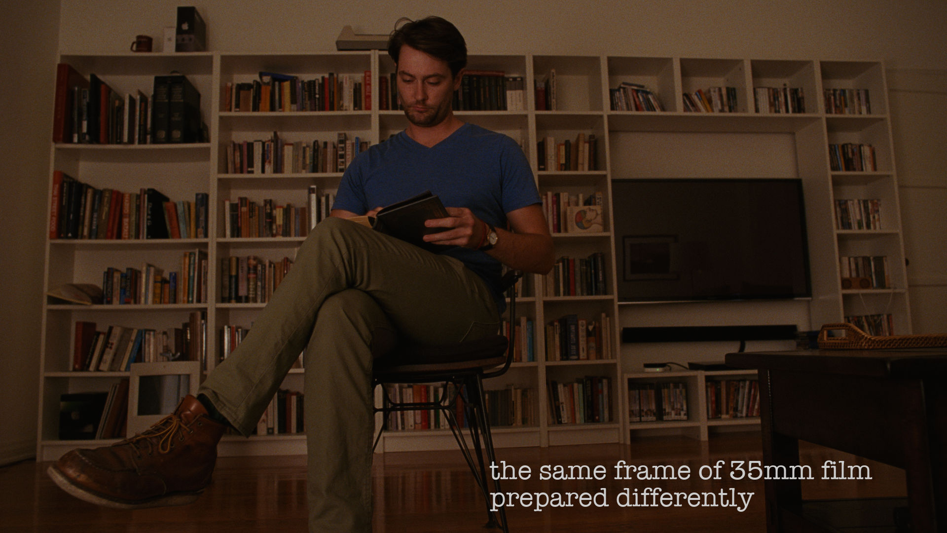
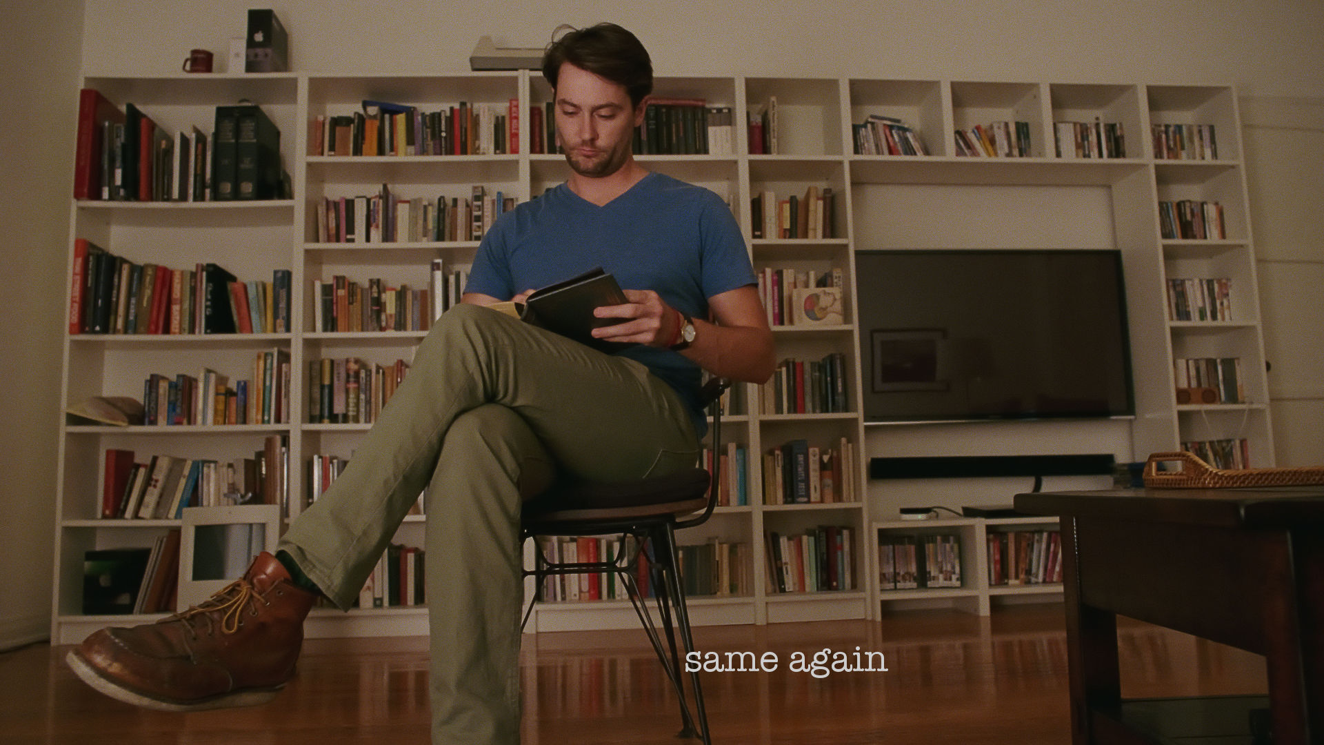
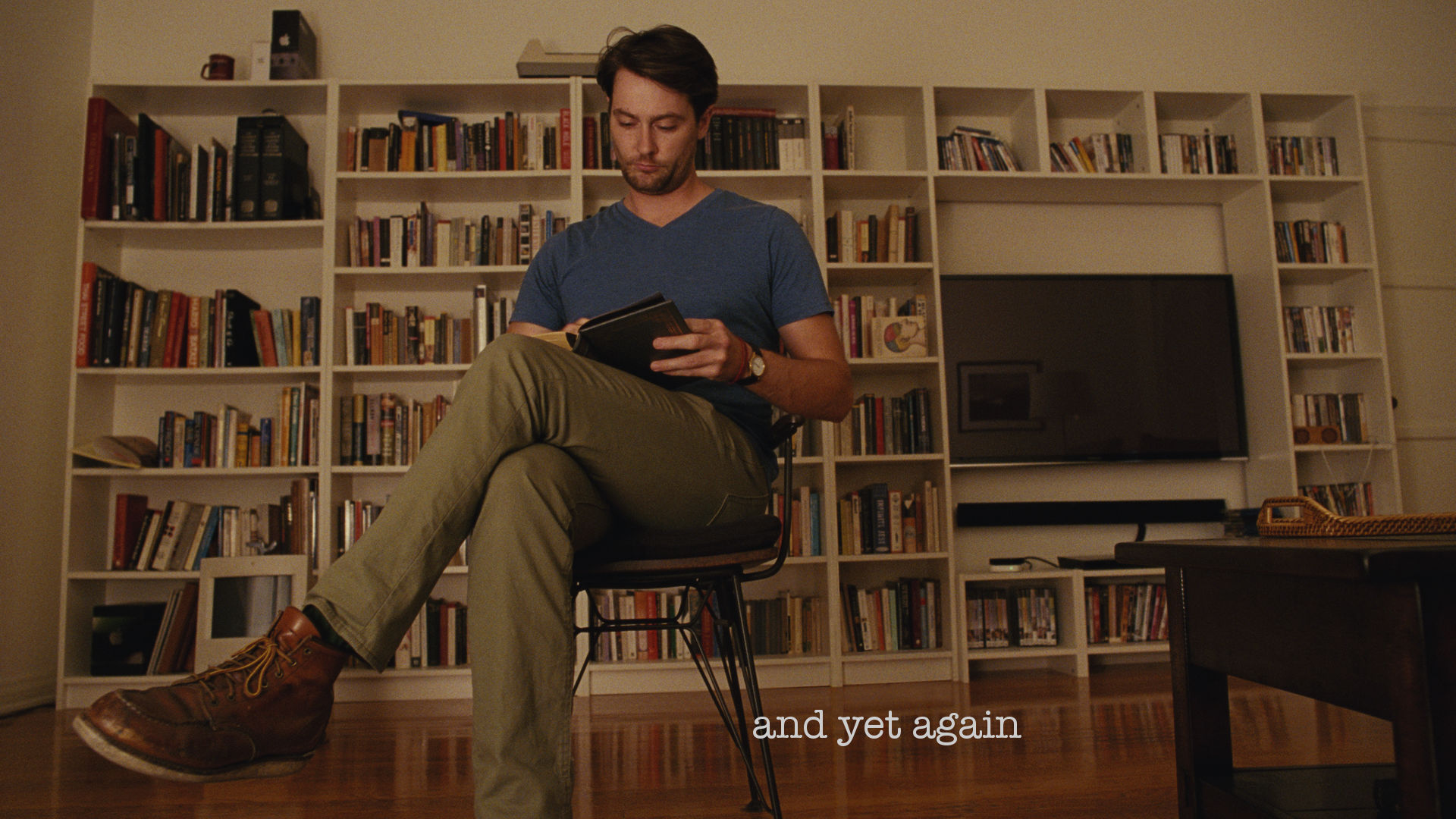
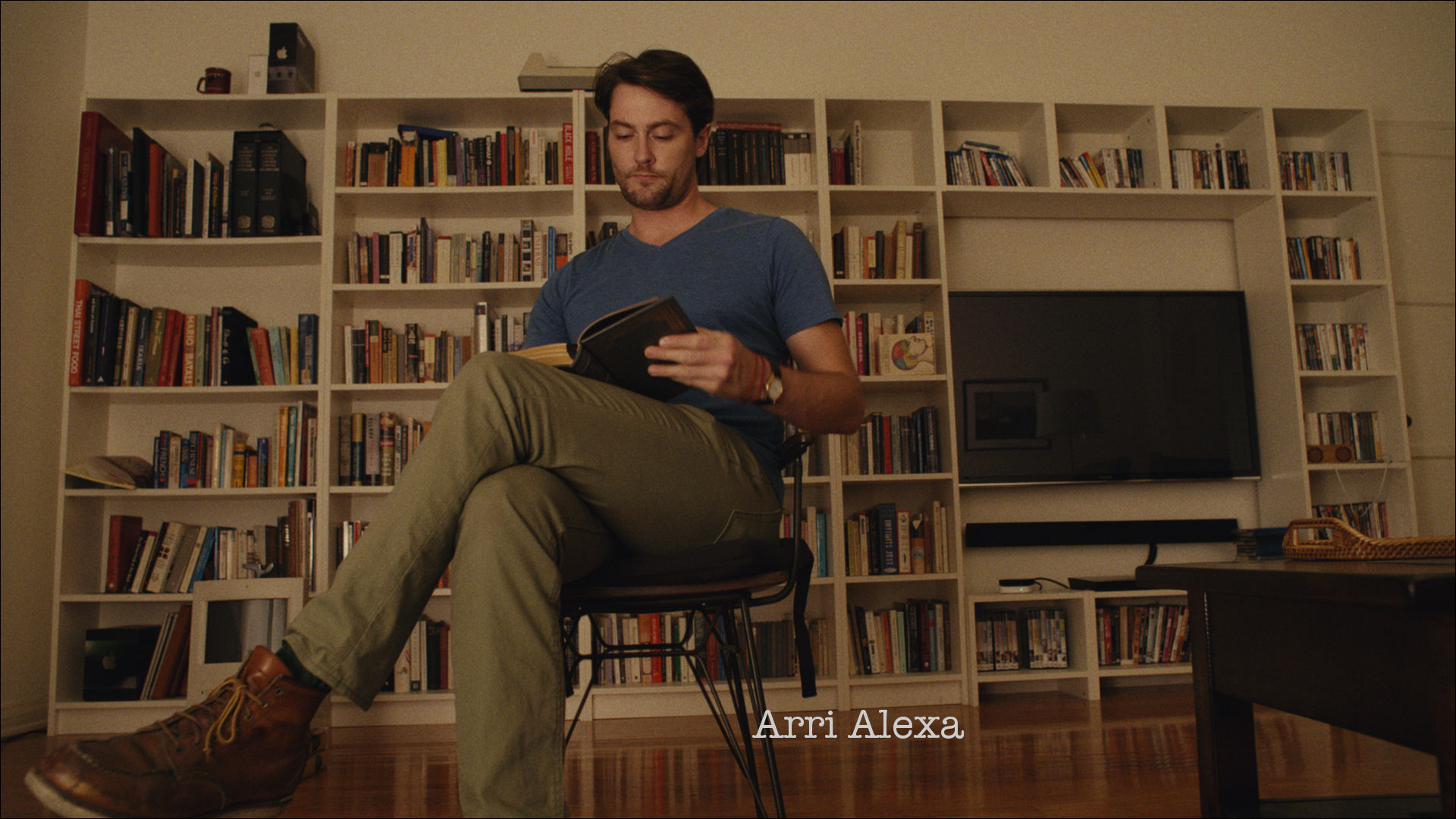
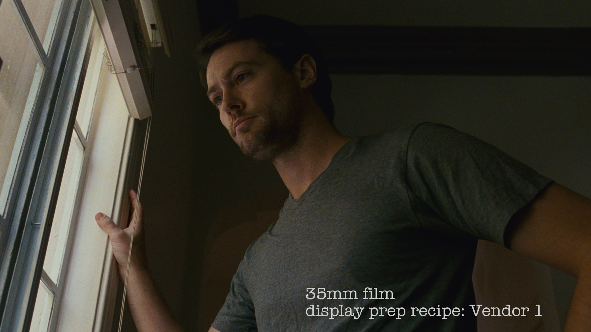
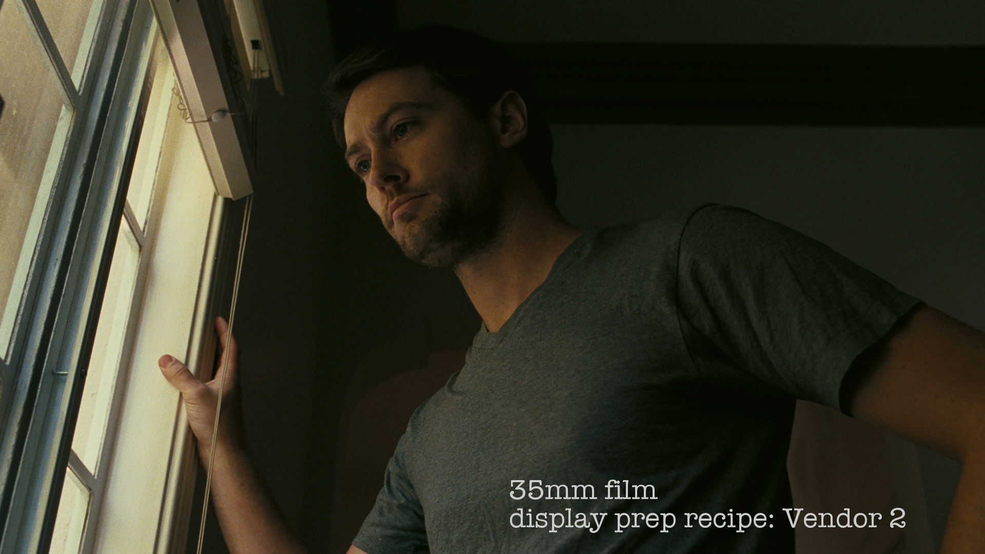
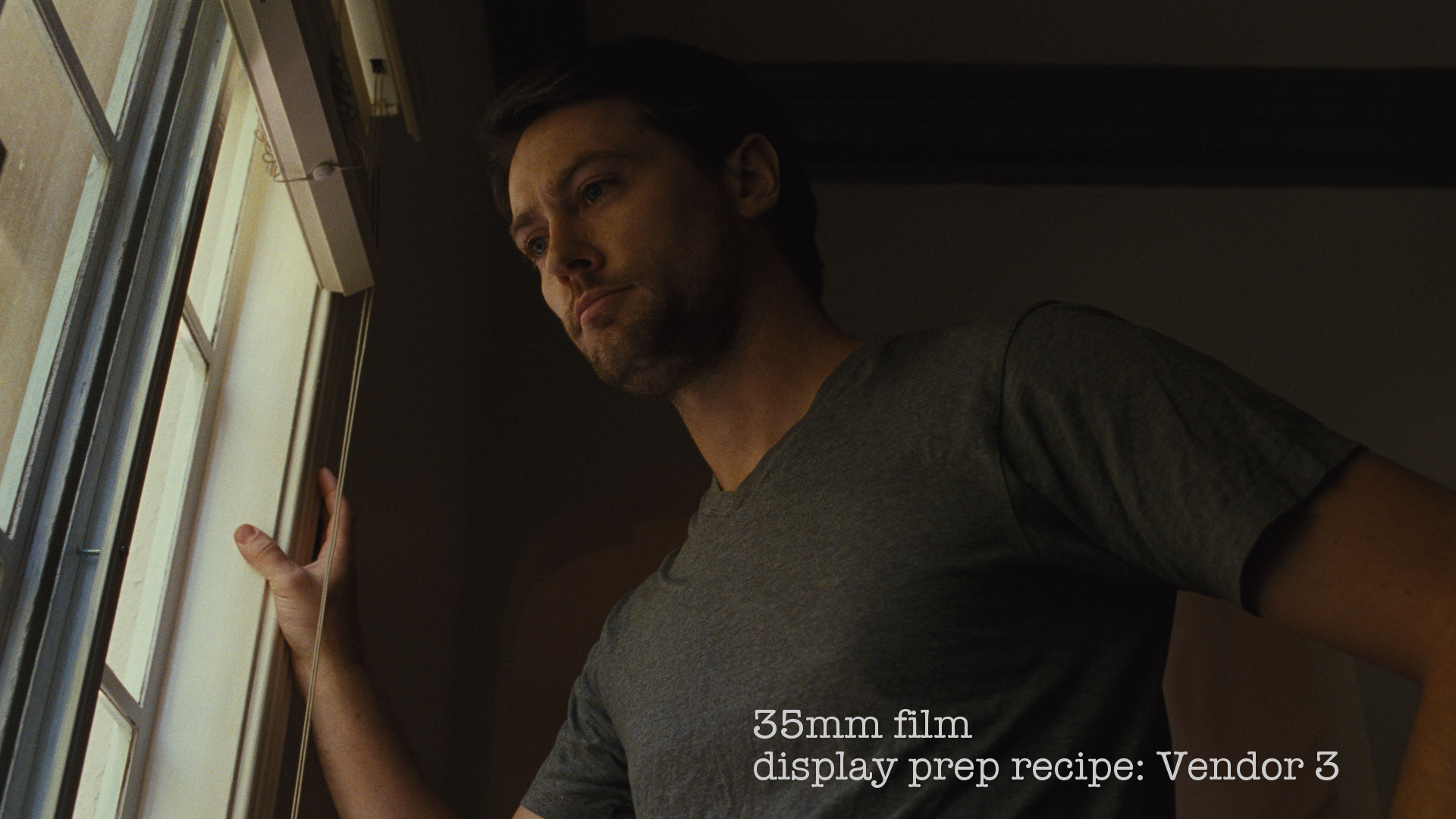
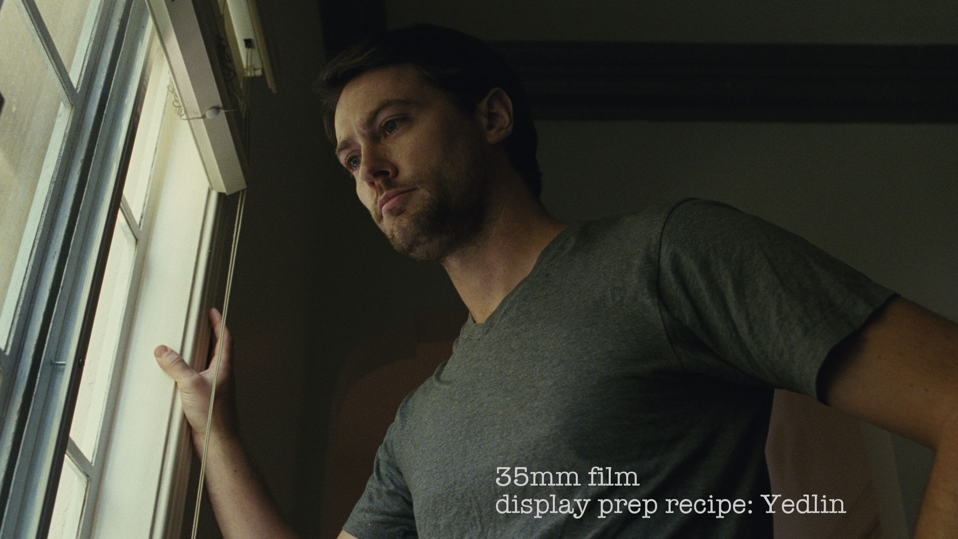
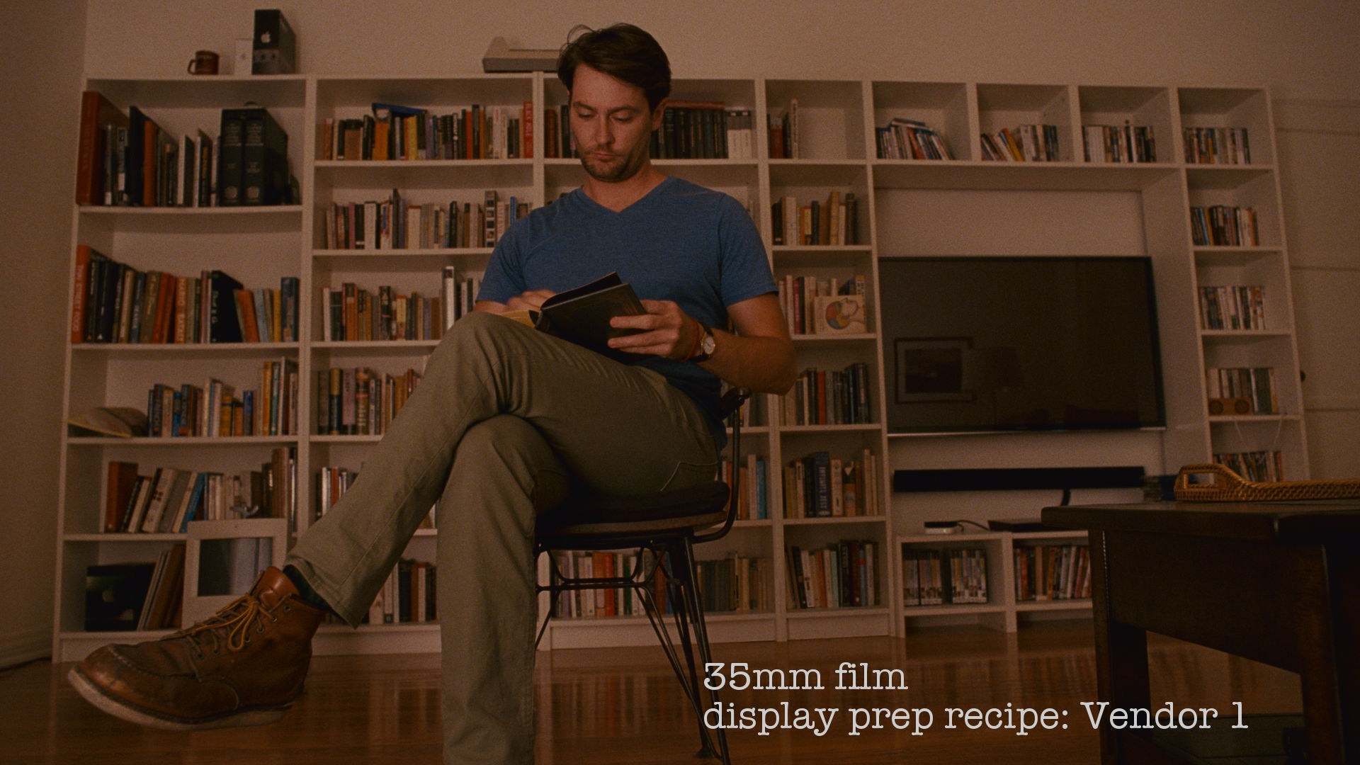
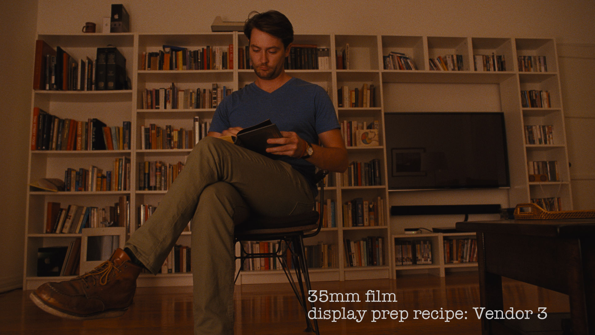
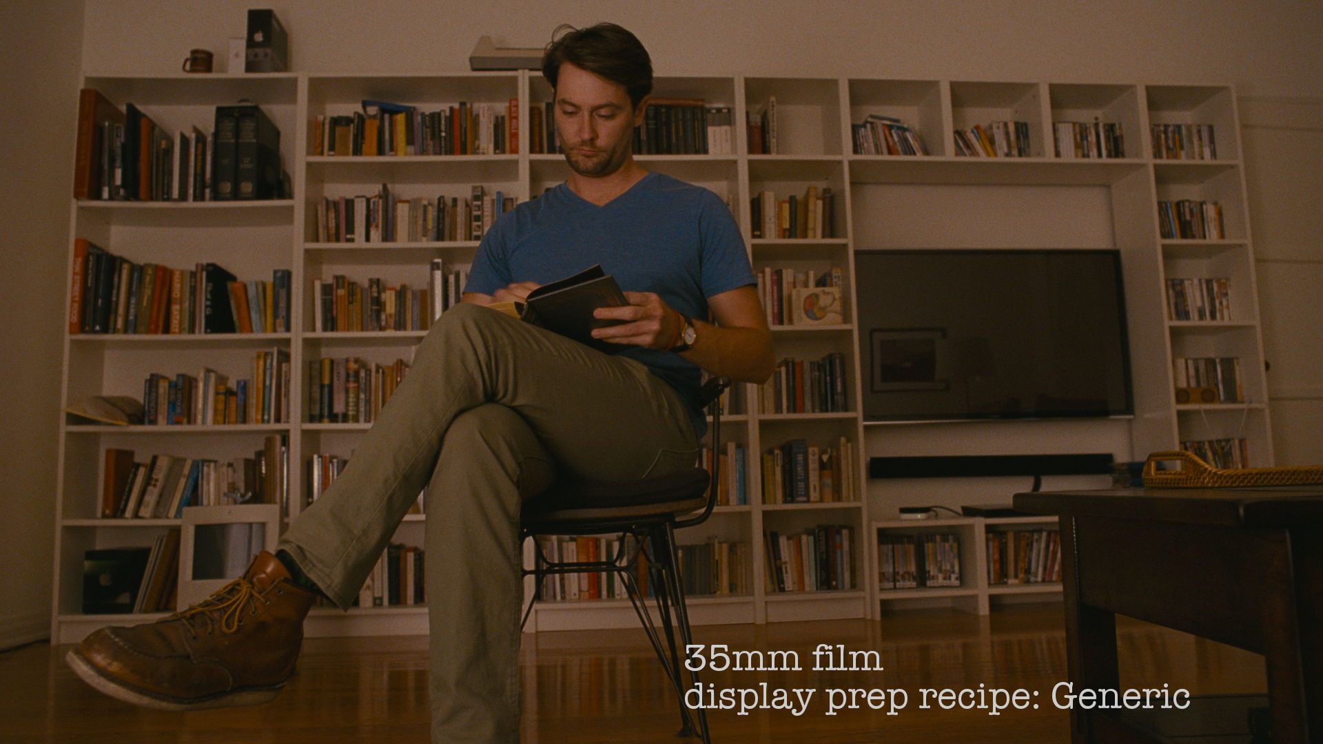
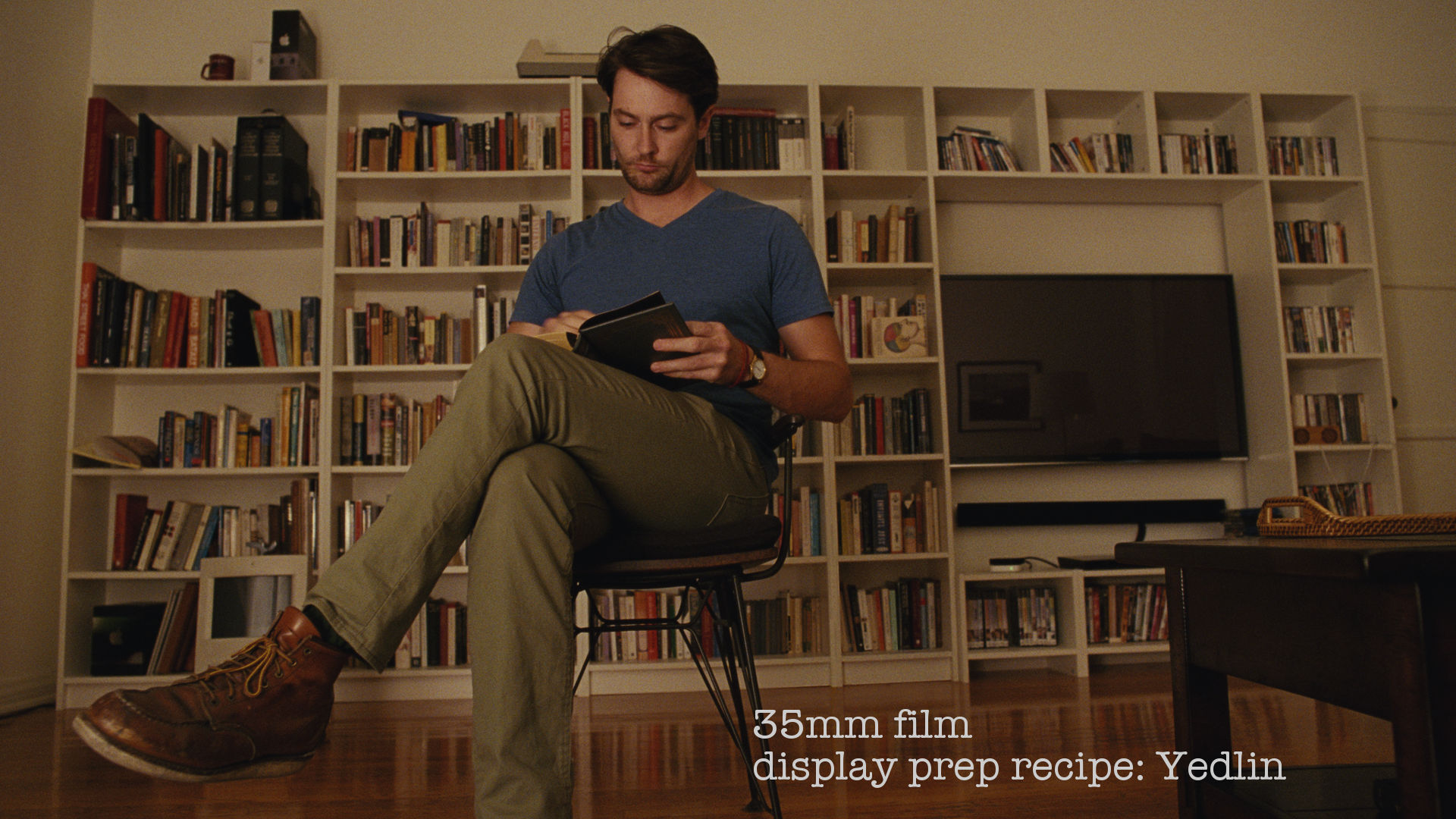
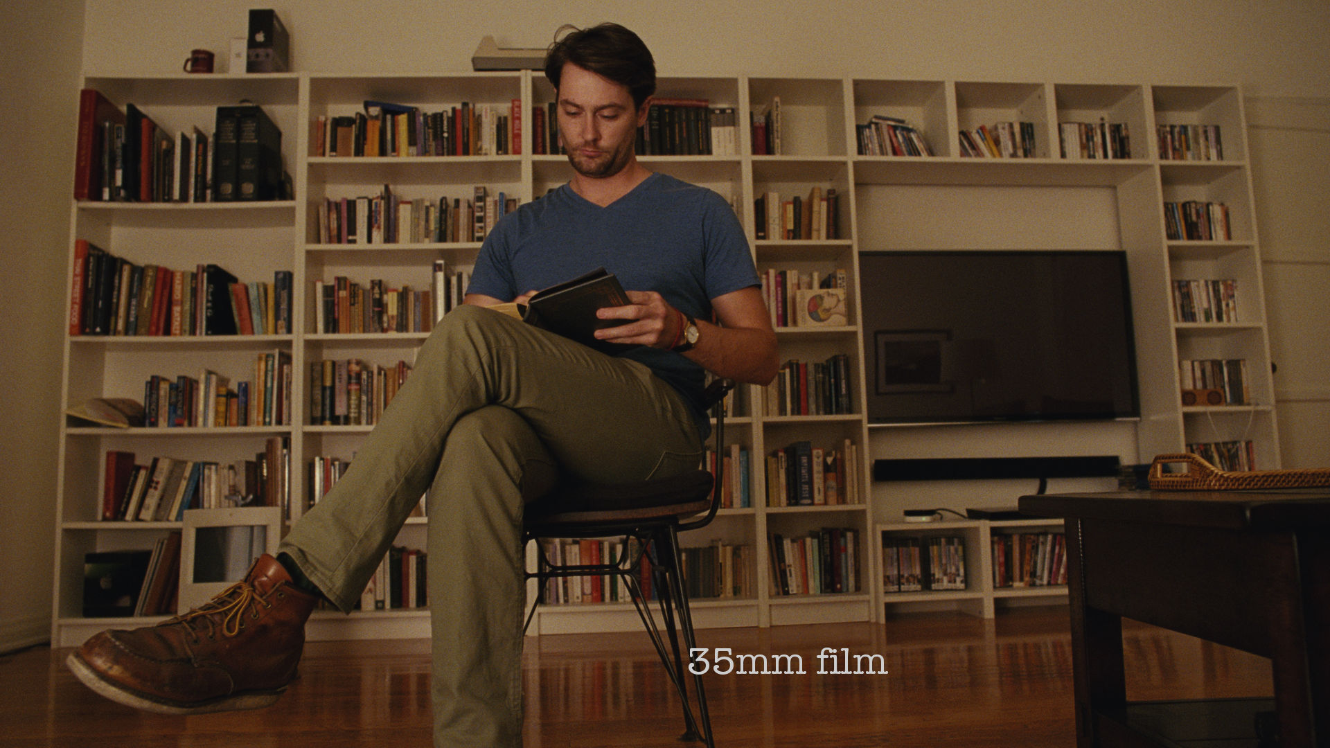
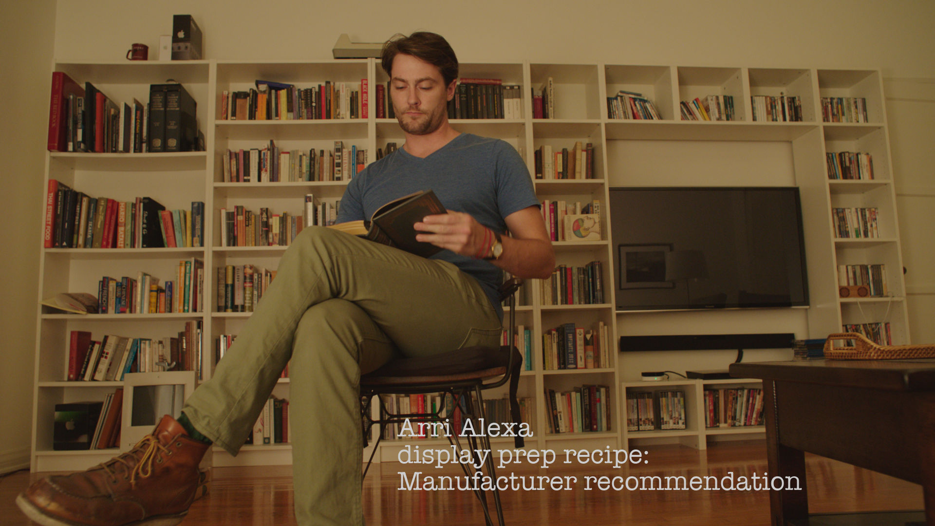
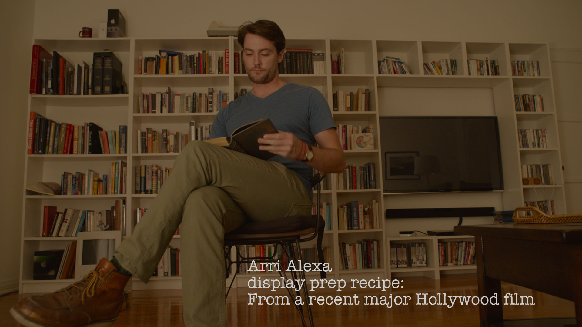
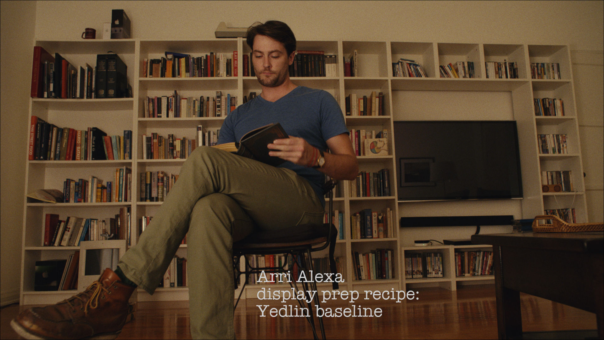
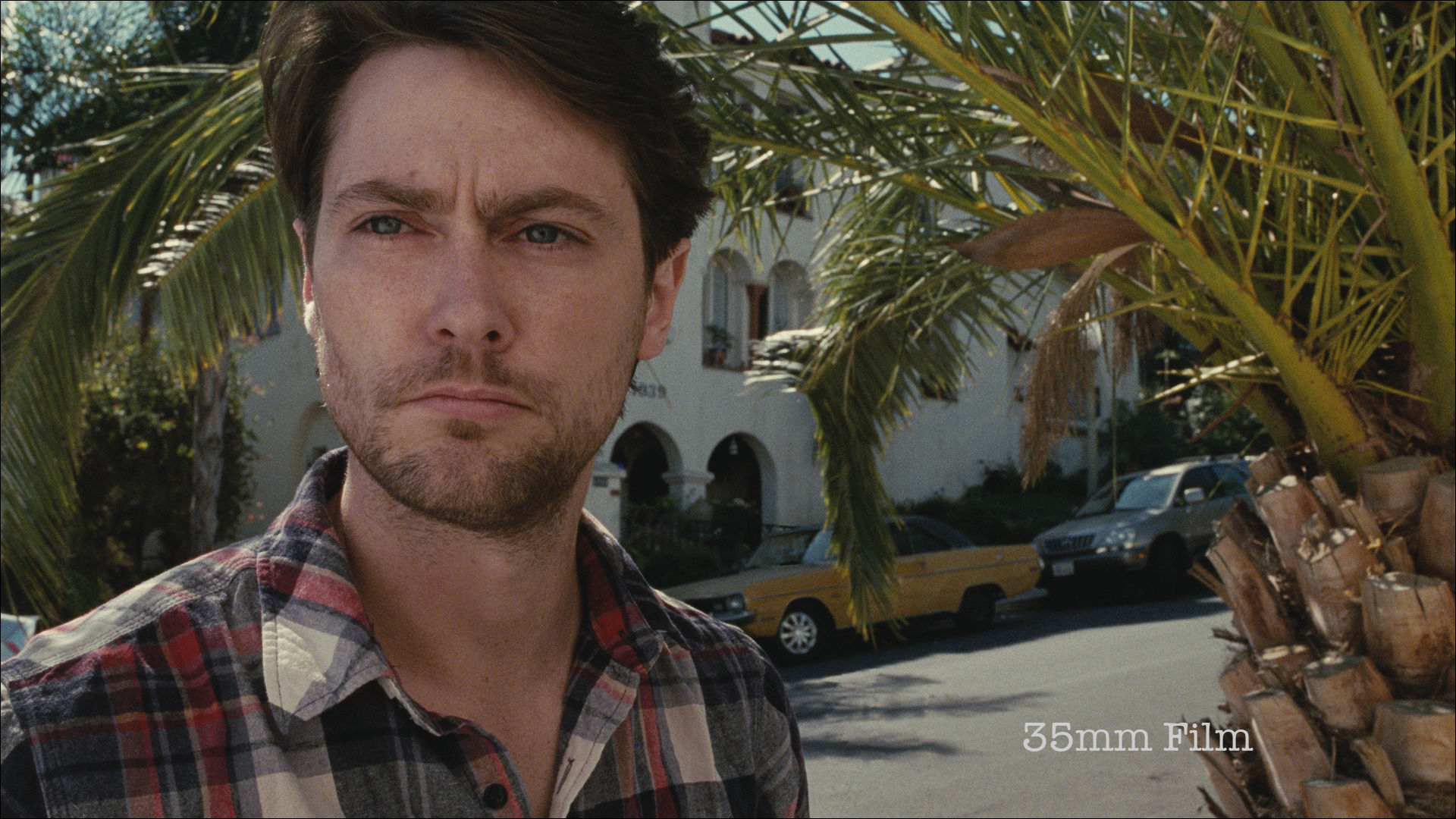
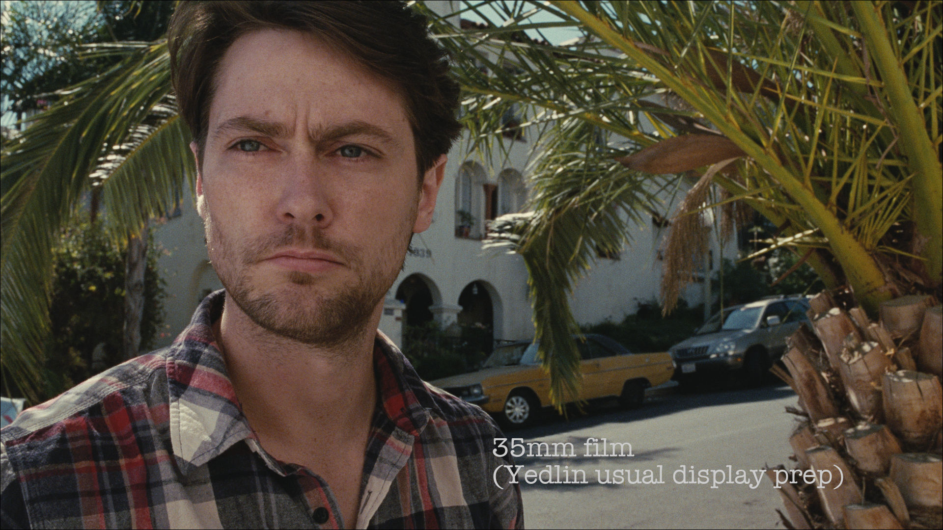
Below, compare a single frame of professionally scanned 35mm motion picture film prepared various ways: first you'll see the scan prepared using the display preparation prescription from a major Hollywood post house, then the same frame with prep math from two more major post houses, then a generic version of that prescription. And finally the base preparation method I currently use myself:
GALLERY 3
These are all the exact same scan of the same frame of film -- and I don't have different color grades on them. Color grades (or "color corrections") are supposed to be subjective and to change shot-by-shot, but the only thing I'm changing here is the math that is supposed to be the technically correct core transformation to prepare all shots for display... before color grading is even applied.
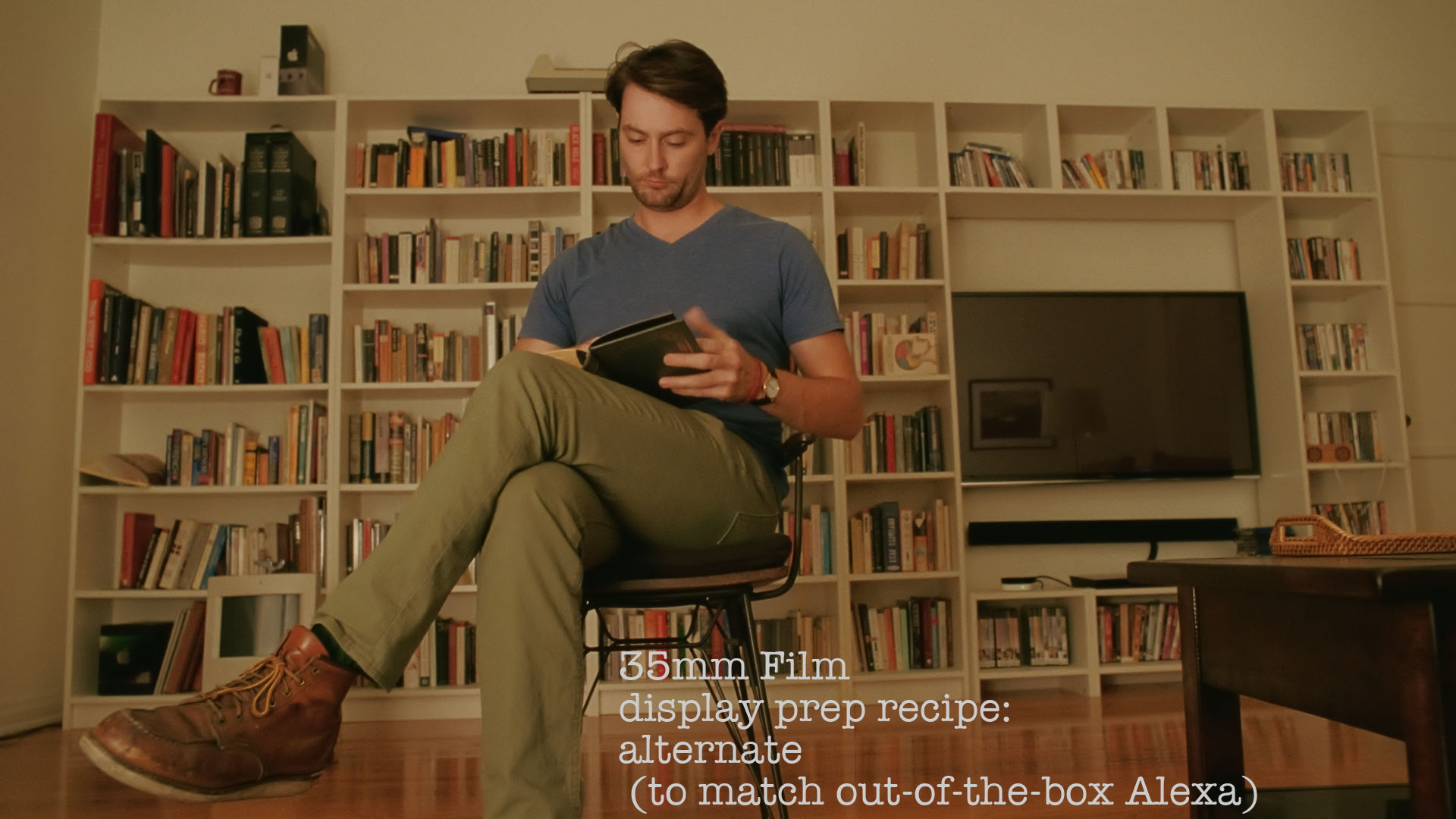
Let's repeat the comparison from Gallery 3 but apply it to the bookcase shot from earlier:
GALLERY 4
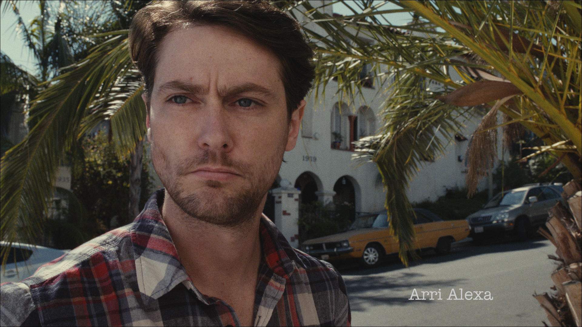
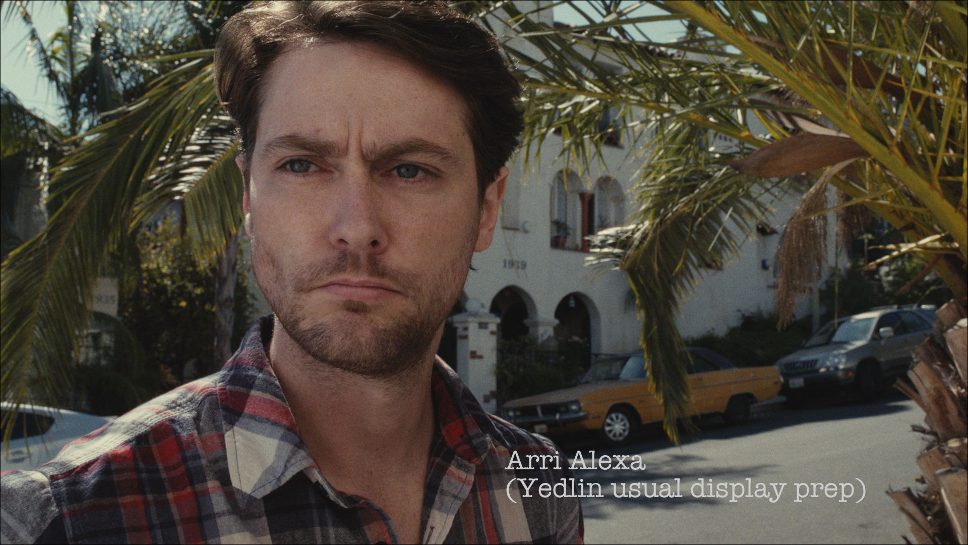
Now instead of comparing different preparations of the same format, compare two different capture formats with equivalent (not identical) preparations:
GALLERY 5
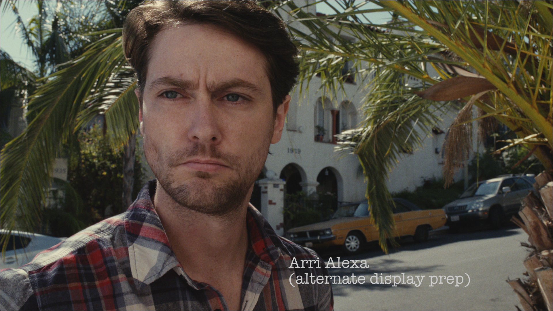
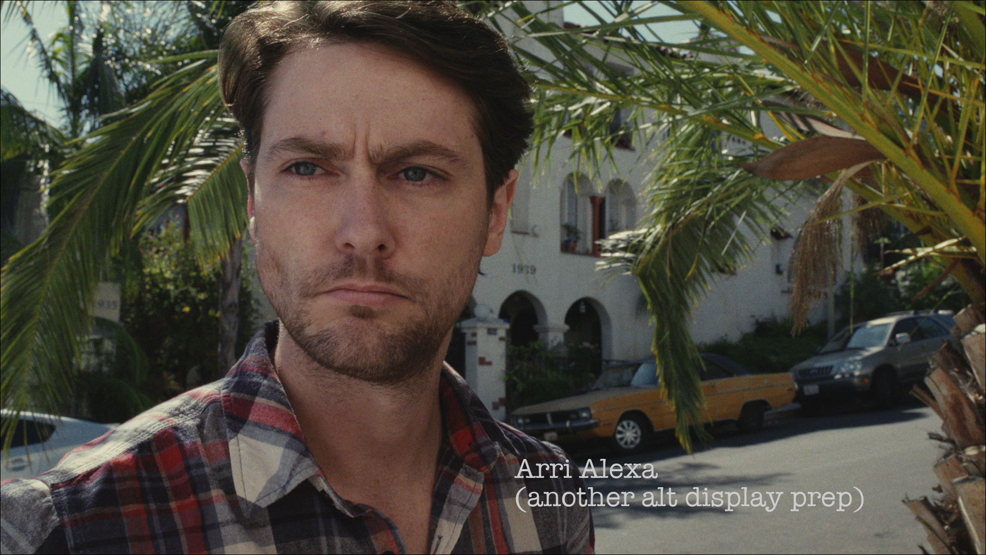
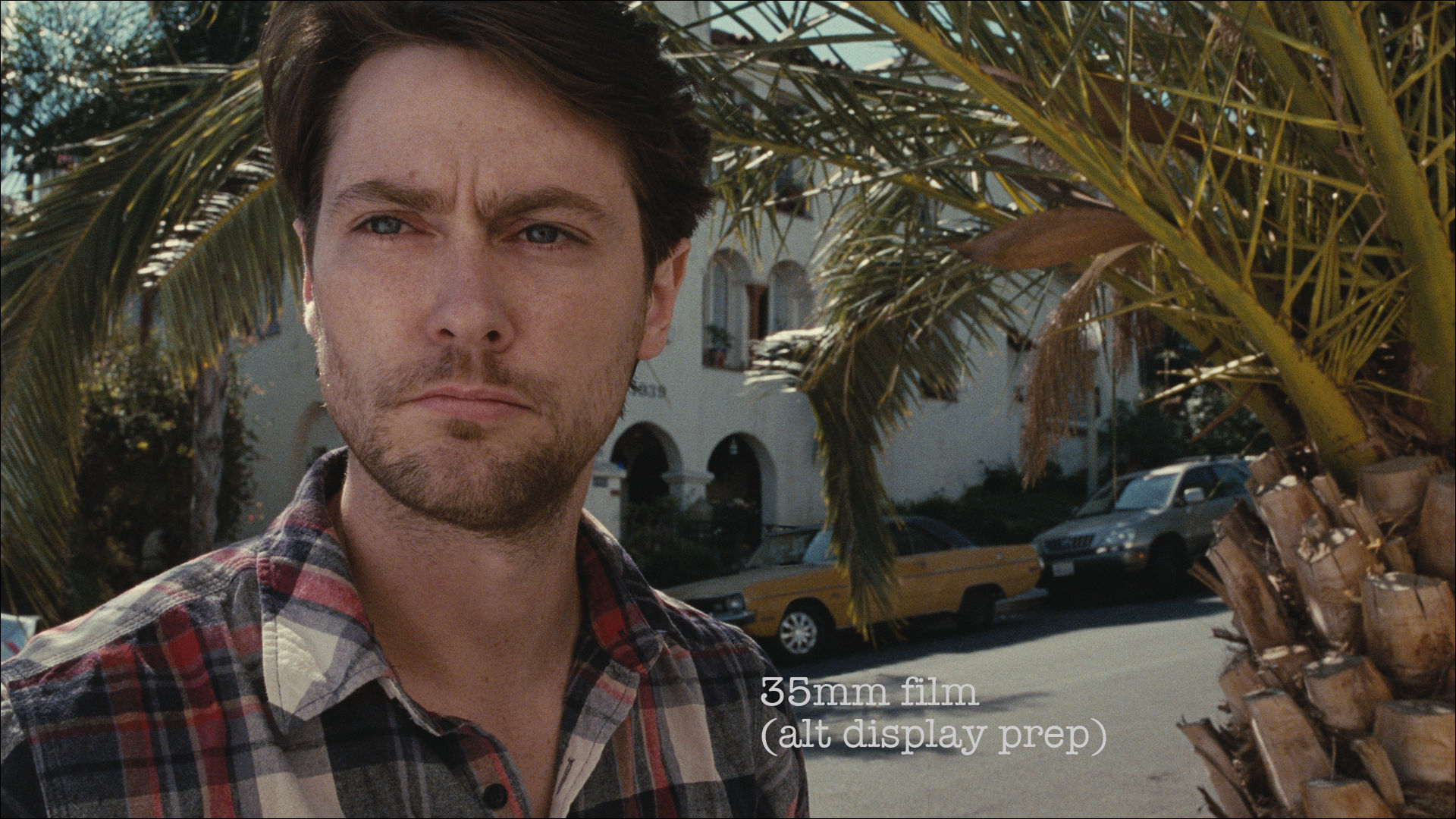
And now compare Alexa alone with different preparation prescriptions:
GALLERY 6
So there's no consensus even from top vendors on what the core starting point is. You get substantial variation in the look just by changing the display preparation of footage from the same camera (Galleries 4 and 6) while you get only negligible variation when using equivalent display preparations on footage from different cameras (Gallery 5).
The collection of attributes that have been customarily attributed to the "look of a format" have been perpetuated not by indelible forces deep within the camera brand but merely by narrow and unimaginative repetition of the same old display preparations.
This was the theme of the Demo: I believe that, as long as you use a professional high quality format, then the substantial part of the look of an entire image chain is not enforced by the capture format but can be crafted in the display preparation.
Galleries 4, 5 and 6 above are evidence that the recipe for display preparation has more bearing on the look than the camera type. We see that, without any different color grades and with no targeted spatial adjustments (such as power windows)... that merely by changing the core display prep prescription, the look is substantially altered.
3. OUTLIERS ARE NOT THE ESSENCE
We've now seen that the look of footage from the same camera can vary greatly depending on only display prep while the look of two different cameras can be almost identical (or not!) depending only on display prep. But let's look a little closer at a few specific outlying attributes that may seem at first glance to be at odds with this assertion.
Below is another shot from the demo, comparing film and Alexa: with my personal baseline display preparation for each format. I personally believe that they both display the same overall photographic look, because the vast landscape of photographic attributes is equivalent (even when not identical) in all ways that are perceptually important to my taste, but it's possible for someone who is inclined to disagree to latch on to small outlying differences that remain and try to argue that those outliers are defined by the camera-type and are the crux of the whole look. Such as the subtle difference in the color of the palm tree:
GALLERY 7
Now remember in the Demo, I prohibited myself from even trying to use my complex adjustments to match the film to the Alexa based on these specific shots and merely did a blanket application of my usual display prep separately for each camera.
Yet some people still responded to any variance at all between the two images as an identifiable thumbprint of the capture format. I believe that although the two tree colors are indeed slightly different, neither is more film-like than the other and the variation we're seeing here might be seen even in two batches of the same film stock or in processing done by two different labs or in processing done by the same lab on different days. (It might also be a result of metamerism: a phenomenon too complex to get into here, but which, if pursued, would merely reaffirm that either of these two colors is a valid representation of what an actual film print might do in real world application. Maybe I'll make a separate post on this topic later.)
I've shown a DCP of the Demo in calibrated theaters to a good sampling of some quite accomplished filmmakers (including some top DPs and colorists) and they never identify which image is film and which is Alexa any more reliably than could be done by random guessing. To my mind, that alone proves that neither color is more identifiably "filmy" than the other, but for a moment let's continue to entertain this position and imagine that the entire subjective sensation or “look" of the image remains staunchly unchanged through wholesale complex changes (as in Galleries 4 and 6 above), and that what is persistently and indelibly responsible for the recognizable look despite these larger changes is somehow a single, smaller attribute... such as the precise palm tree color in Gallery 7.
So, if we pursue this line of reasoning: film must and always will have a slightly bluer palm tree color and Alexa must have a slightly yellower palm tree color, as seen in Gallery 7. And that -- and nothing else in the broad landscape of photographic look -- is somehow the essence of this particular look... It's the indelible mark of the camera that will always give itself away no matter what we do in display prep.
Well, we know I used my own personal display prep recipe in the Demo. But my personal process is not the only possible one. Here's another slightly different but perfectly valid one for the Alexa thrown into the mix:
GALLERY 8
Now the Alexa also has bluer green in the palm tree, like the film did in the Demo. Or let's throw yet another option into the mix:
GALLERY 9
Now the Alexa has bluer green than the film:
Now let's go back to my usual prescription for displaying Alexa... and change the film's method instead:
GALLERY 10
Now the film has yellow green like the Alexa had in the Demo.
Clearly, there is something wrong with this line of reasoning that assumes that the perceptual attributes are indelible traces from the camera format -- that the essence of the look and the camera-brand are inextricably bound together. This assertion that the important recognizable aspects are enforced by the camera and must always shine through the display prep falls apart when we see that not only the overall landscape, but even those few remaining outliers can be altered any way we like and are not persistent hallmarks of the camera.
Galleries 8 to 10 demonstrate that it's a certainty and not just a possibility that the subtle variation we were seeing in the palm tree's green was not due to the fact that film cameras indelibly enforce bluer greens and Alexa cameras irrevocably enforce yellower greens. Instead, it was due to the coincident circumstance that my own unique method of display prep for film happened to create bluer greens than my own unique display prep method for Alexa. I easily could have used a different transformation and had a different result. And the same holds true for the preparation of the film footage.
Because, of course, film too goes through its own preparation for display as does the digital footage. This means that not only can Alexa footage be prepared with the perceptual attributes usually associated with film but, conversely, film can also be prepared with the perceptual attributes usually associated with the Alexa:
GALLERY 11
It seems inescapable that the photographic look is not enforced by the camera brand. We can modulate it with math. But only if we do our homework to learn how to do so.
We need to start giving more respect to the mathematical transformations that prepare our image data to be viewed and recognize them for what they are: a major contributor to the photographic artistry or lack there of.
These transformations happen to every single professionally mastered image whether we admit that they do or not, and whether we exert any control over them or not. Rather than ignoring them or assuming they're unalterable or that they don't exist, it is time to learn about them and master them as creative tools that allow us to retain our authorship.
4. EMPIRICISM FREES CREATIVITY
All of this is possible, but not with the methods we've usually been using.
When filmmakers with brand allegiance to celluloid deride digital acquisition as having a recognizably bad video look, they're absolutely right in describing a survey of what they've seen in the past. But the reason they're right is not the reason they often proffer, which is that film enjoys some sort of magical privilege that digital is perpetually barred from. It's simply because many filmmakers today who use digital formats unquestioningly accept the standard methods of display preparation which are rooted in video engineering and not photographic richness. The two recognizable looks being compared (the "film look" and the "video look") are merely the most stereotypical of pre-packaged display recipes for each camera-type, not mutually exclusive attributes enforced by the camera or film-stock brands.
Trying to take digitally acquired images and achieve a traditionally cinematic look using mere color grading is more problematic than often recognized, because color grading tools in their current state are simply too clunky for that kind of crafting. Though color grading may seem complex given the vast number of buttons, knobs and switches on the control surface, that is only the user interface: the underlying math that the software uses to transform the image is too primitive and simple to achieve the type of transformations I'm talking about here.
Contemporary color grading, though a very important part of the creative process, is a polishing step that is not interchangeable with and cannot replace the subtlety, nuance and complexity that goes into the development of the rich transformations that define the core of the complex perceptual look.
This is not different from how it used to be in the old days of traditional film printing: back then, a Color Timer was the artist who finessed printer light adjustments for color grading. That job of Timer was totally different from the role undertaken by Kodak's scientists and chemists when they created a print stock. In those days, Kodak color scientists developed the complex transformations that took camera data and prepared it for display. These tools were extremely complex to develop but once they existed were used on all films, for all scenes, for all looks. A Color Timer, on the other hand, was a creative user of those tools, not the creator or designer of the tools. The Color Timer was the one who adjusted colors differently for each movie, each shot, each scene, each look -- but always used those same tools developed by Kodak to do so.
A Color Timer and a Kodak scientist were each crucial to the process, but they were responsible for very different areas of expertise that would never have been mixed up.
Although it's not often enough recognized, it's not so different today: the development of mathematical transformations for preparing image data for viewing is its own domain and plays as crucial role as ever in the photographic look. Too few filmmakers recognize that this process even exists let alone its importance in the aesthetic of their craft as the formative core of their image.
5. DIVING IN
At this point you might be thinking: all right Steve, this sounds great, but I'm a filmmaker, not a scientist or a programmer or a mathematician; how can I hope to identify these attributes individually let alone manipulate them in an aesthetically meaningful way with mathematical expressions?
Well, firstly, in the larger picture over time, if we as filmmakers begin the process of educating ourselves and revising our dominant narrative and our lexicon, our vendors and collaborators will eventually have to change their own paradigm to accommodate us instead of merely exploiting the current belief system for manipulating us into brand allegiance. And more importantly, these concepts will become intuitive instead of foreign to all of us.
So, one immediate thing we can do is merely to include these larger concepts in our purview and in our discussions, even if we have to leave the fine grained details to specialists.
Another thing that can be done immediately is that we, as filmmakers, really can begin to understand some of the basics for ourselves. And we'll have to if we truly want to be authors of our photographic look. It's within reach and it's not that hard. To get into too many details is beyond the scope of this text but a quick summary isn't:
6. THREE CATEGORIES OF ATTRIBUTES
Firstly, as a starting point, let’s split the many attributes of the photographic look into three broad categories: intrapixel, spatial, and temporal.
The first, intrapixel, is the most complex and perceptually important. It includes contrast, density, color idiosyncrasies and so forth -- I call these intrapixel (even when looking at an analog system) because these attributes don't arise from areas of the frame affecting one another. Each area responds to external stimuli (or to a transformation) in the same way as each other area in the frame. These aspects are sprawling and complex but within them are included some concepts that you might recognize from stock phrases like "highlight rolloff,” "skin tone handling," or "color rendition."
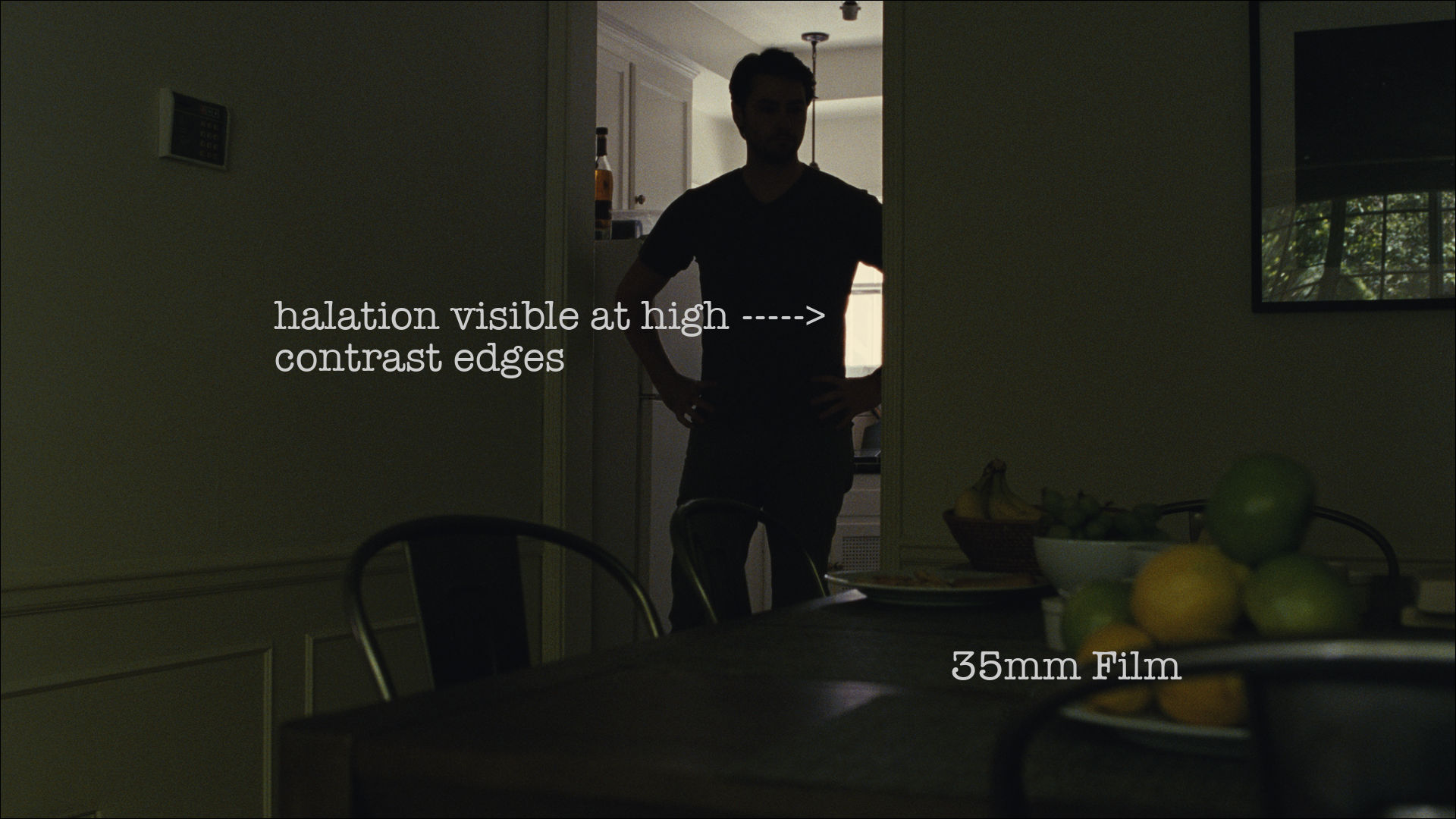
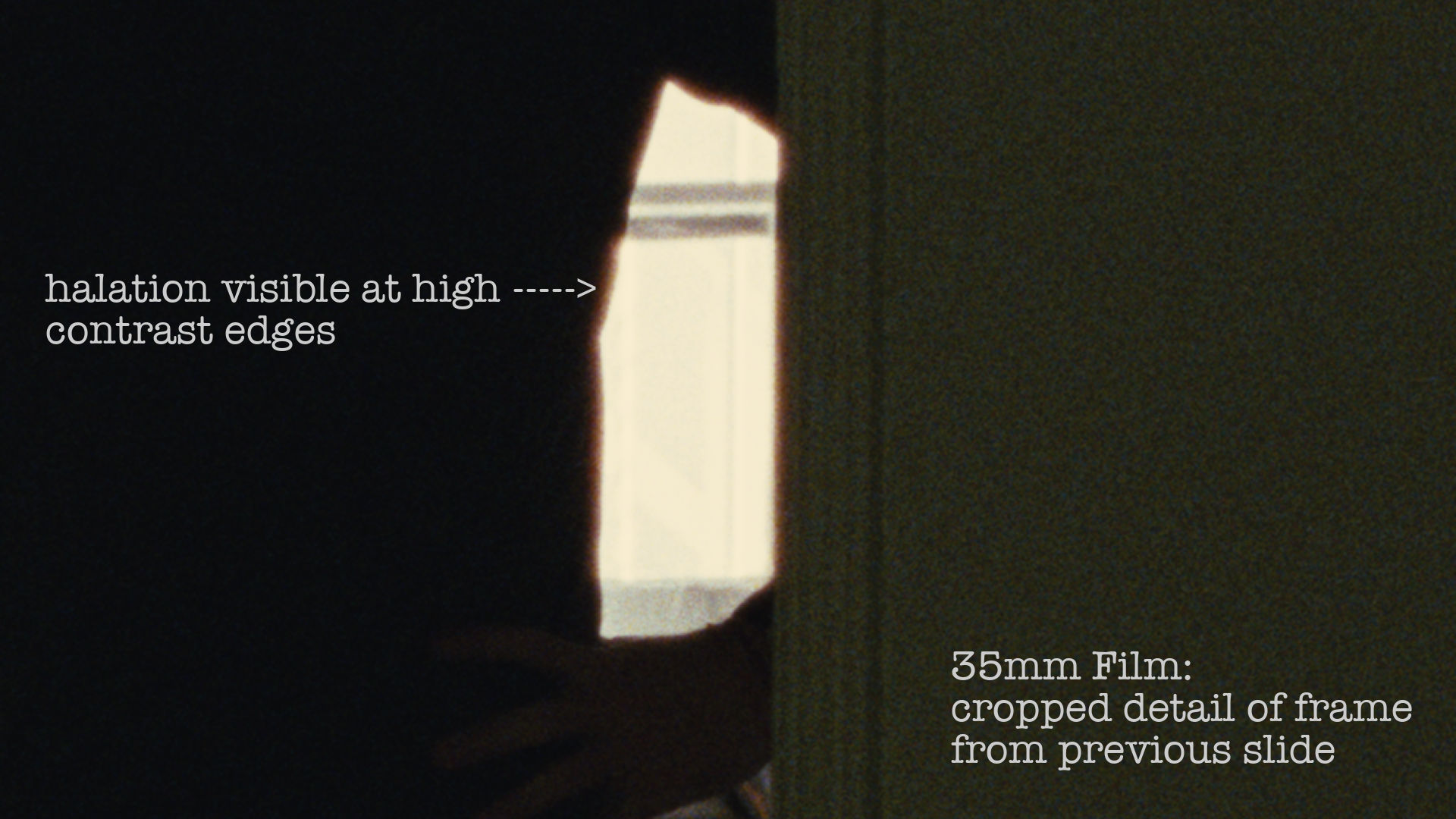
The second category is spatial. These attributes have to do with how areas within the frame do relate to one another. These include resolution and apparent sharpness (which by the way, contrary to the usual presumption, are two totally different things). This category also includes some more idiosyncratic aspects like film halation; that's the characteristic phenomenon in film acquisition responsible for several visual attributes, most recognizably a reddish wrapping of light at high contrast edges.
GALLERY 12 Halation
The third category is temporal. Temporal attributes have to do with motion and time, including things like motion blur, exposure time, frame rate, and sweep speed of a rolling shutter.
Some perceptual attributes don't fit neatly into exactly one of these three categories. For example, film's gate weave (its slight unsteadiness from frame-to-frame) is both temporal and spatial. Or film's grain: that's an attribute that can be addressed equally as temporal and spatial or as temporal and intrapixel.
7. MANIPULATING THE ATTRIBUTES
Moving on from categorizing attributes, let's talk about manipulating them. I'd say there are also three very broad categories of things we need to do with these attributes if we want to be authors of the photographic look.
CATEGORY 1: EMPIRICAL IDENTIFICATION
First, we need to do the work to identify empirically rather than intuitively which of these attributes exist and/or which are perceptually important to us by doing isolated comparisons, so we can actually understand unambiguously their visual and technical impact rather than guessing or assuming. We can't manipulate visual elements creatively if we don't know what they are or how they affect the eye. The previous section merely gave broad categories in which to place the attributes -- it didn't exhaustively identify the possible ones individually or investigate their importance, but doing so is necessary if we want to attain expertise in photographic look.
For example I've often heard the unsubstantiated assertion that film negative can be scanned at ever increasing pixel counts to retrieve ever more resolution information out of it. But film has limited resolution. It's an analog limit instead of a digital one, but it exists. The fact that you don't know how to easily quantify the limit does not mean it's unlimited; it just means that you don't understand the limit. To understand it, you'd have to do a controlled variable test where you scan at various resolutions and see where the advantage breaks down. The same goes for all kinds of attributes which filmmakers too often wrongly assume they know something about just by intuition, by supposed common knowledge, or by doing flawed or biased tests where variables aren't properly isolated.
Grain, contrast, spectral response and many others: we need to study the actual perceptual effects of various aspects rather than making assumptions, because unambiguous and undeniable empirical data often stands in stark contrast to intuition, to common belief, and to anecdotal or cherrypicked evidence.
One of the most prevalent unsubstantiated assumptions is that one single attribute (as opposed to the aggregate of many) is solely responsible for an entire photographic look. For example: the intuitive and unfounded presumption that I've sometimes heard asserted that the photochemical look is comprehensively induced by grain alone with no credit being given to celluloid's other attributes. Or another example: the belief that the so-called "video" look is invoked entirely by edge sharpness alone, when it actually arises from many attributes. Yet another: that counting up the number of photosites on a digital camera's sensor is a comprehensive measure of how "good" the camera is.
CATEGORY 2: DATA COLLECTION
We must push for more rigorous and meaningful evaluation of camera systems.
Today vendors can count on brand allegiance and confirmation bias to guide us and to ensure that our opinions are resistant to scrutiny. They can count on us to psychologically project onto a product any attributes we've been conditioned to believe it has, to cherry pick anecdotal evidence to support preconceptions, and to design biased comparison tests that don't isolate variables. To be authors of our photographic look we must reimagine what a camera test even is to break the cycle of bias.
It's tempting (and common these days) to try to reduce all of the complex qualities and unintuitive attributes of a camera system down to a single slogan that ostensibly encapsulates all of its characteristics. Like: "Kodak's film is magic," "Arri's Alexa is filmy," "Red's Weapon is 8k," or "Sony's F65 is the only true 4k camera." But whether these mantras are more subjective sounding like the first two or more technical sounding like the latter two, these oversimplified slogans (even if true in some sense) don't get us closer to useful understanding, they merely evoke imagination to produce expectation; they reinforce preconceptions and belief bias. They discourage curiosity and instill confidence that we need not investigate any further, while not providing any essential information to be confident about. Simplifying is not the same as clarifying.
We need to test our capture formats in rigorous ways to understand if a camera system is getting enough information and information of the right kind for the look we want. Because as I said earlier, any format can be molded to any aesthetic look, but only if the acquisition format captures enough information to do so. We also need tests that precisely map how a camera packs image data into its media so that the data can be manipulated in a meaningful way further down the image chain.
So, we need camera tests that separate pure data collection from aesthetic look. We also need to separate underlying data from mere out-of-the box display preparation.
Here's a hypothetical illustration of this imperative:
Let's say I'd like to design a traditional photochemical look for a movie and that in preproduction I'm testing two digital cameras as candidate capture devices. Let's imagine that Camera A has manufacturer-provided color mapping that looks to my eye kind of film-like but the camera cannot retain as much highlight data as film negative. Let's also suppose that this camera's rolling shutter sweep time is much slower than a film camera's (yes, it may come as a surprise but film cameras have rolling shutters too. They just have shutters with fast sweep time).
Now let's say that Camera B has manufacturer provided color mapping that looks very garishly electronic and off-putting to my personal taste but the camera has better highlight retention than film does and a shutter sweep that's perceptually indistinguishable from film's.
Well, if I don't understand which attributes of the camera are actual data collection and which are sculptable parts of the look, I may foolishly choose Camera A merely because it looks more filmy to me out of the box or in a test where variables aren't isolated. But Camera A's actual data collection is inferior to the system that I'm trying to emulate (print film). I can never retrieve the lost highlight data from its limited latitude and I can never retrieve the lost temporal data from its slow shutter sweep. Camera B collects more actual data about the scene in front of the lens than Camera A does, so Camera B is the only one of the two candidates that collects enough data to properly emulate a traditional photochemical imaging chain for my taste.
But I need to sculpt the data! I need to replace the manufacturers color mapping that I don't like with a mapping that represents my intent. Recovering data that was never captured is impossible. But what is possible is to remap captured data to our desired look. So Camera B is a better choice.
This has been a simplified example, and the concept applies to many other attributes.
If we rhapsodically intone that a camera has inherent aesthetics and refuse to isolate its technical attributes, all we're doing is limiting creative choice, not expressing it. Reciting the familiar mantra that selecting a camera type is a "creative decision" is really just a way to disavow ourselves of creative control and leave it up to the off-the-shelf bundle provided by our chosen brand.
So how can we sculpt that data to have the desired display attributes if the camera doesn't do it for us automatically out of the box?
CATEGORY 3: TRANSFORMATIONS
In Category 1, we study how aesthetic sensations arise from technical attributes, so that we know what the visual building blocks are empirically, instead of relying on intuition or hearsay. In Category 2, we isolate variables to find out how much information of various types our imaging systems are capturing and how that data is organized within the recoding media. And now, in Category 3, we need to sculpt the camera data for display, giving it all of our desired attributes and authoring the photographic look. We've precisely tracked the data so we know where it's coming from, and we've unambiguously designed a destination for it... but we need a remapping process to bridge the two. So, we need some sort of algorithmic tools for doing these types of complex transformations. This isn’t something you have to do yourself if it is overwhelming, but it’s important as authors to have some understanding of the steps involved and add them to our lexicon.
There are unlimited possible transformations that can be used either to invent a look from scratch or to use data sets to build rigorous mathematical models and then map one system's response onto another's. Let's look summarily at some of the algorithms I used in the Display Prep Demo to conform the three types of attributes. Starting with the intrapixel attributes:
A simple but powerful transformation is tone mapping. This is similar to "custom curves" in a color corrector except it's determined with a combination of empirical experiment and math instead of by subjectivity. In this way, we match one system precisely to another in its tonal response all through the latitude range.
But tone mapping only matches density, luminance, and contrast but not complex color response, so we need more than that. We also need to sculpt data points all through the three dimensional color space in a way that is more complex, nuanced and idiosyncratic than what can be effected with usual color grading tools.
To do this we need both three dimensional geometry and scattered data interpolation. These are two broad categories of processes by which we can either make aesthetic changes or take large data sets about two capture systems and map one onto the other even if they differ in overall shape and/or by many local irregularities.
With 3d geometry, we can sculpt and reshape the whole constellation of 3D color data in various ways that are much more complex than can be done with a conventional color corrector yet are smooth, uniform contours that don't rip the image apart. Or, we can achieve even more complex and non-intuitive transformations with scattered data interpolation, which can re-sculpt the overall shape of our image data in much more irregular and non-uniform ways than even 3d geometry and can also give us very localized idiosyncrasies that don't affect the overall shape.
The animation below shows two data sets regarding color response, acquired in controlled experiment: one for Arri Alexa and the equivalent one for 35mm film (Kodak 5219, scanned with carefully defined settings using the Scanity film scanner). Scattered data interpolation can map one data set precisely onto the other, which is a transformation much richer and more complex than traditional color grading can achieve. In the animation, the data points are graphed in 3D color space (the three axes are Red, Green and Blue), and the view is rotating to help show on a 2D screen what is happening in three dimensions.
Scattered Data Interpolation: complex and irregular (yet smooth!) re-mapping of color data
That's a summary of intrapixel attributes, but what about spatial and temporal aspects?
Well, for film grain, I've developed my own algorithm which, unlike many grain plug-ins that try to record and then repeat apparent grain geometry that happened to occur on one specific occasion on one specific strand of film, I've taken an empirical data set of real film, studied the probability distribution for various grain amplitudes and emulated that probabilistic distribution of those amplitudes. Thus I use a totally empirical model of real film... But the algorithm is probability-based instead of geometry-based.
I have similarly empirical custom algorithms that I've developed to make mathematical models of film's halation and film’s gate weave. These are attributes whose existence and contribution to the overall look often isn't even recognized, let alone modeled rigorously.
This section has been a mere overview -- an abstract peek into these processes. Getting into functional details is beyond the scope of this document, but I hope some readers will be inspired to dive in for themselves and look at all of this much more closely.
8. NEXT STEPS
Now let's refocus away from finer details and take a broader view: think about what this all says about the current state of affairs for filmmakers: On the one hand this is all possible and within reach today and not just in a sci-fi future. But on the other hand I had to build custom tools from scratch because existing off-the-shelf solutions were not suitable. This says a lot about where we are with these color science studies at this point in history. We are simultaneously woefully mired in legacy problems and yet poised for a big leap forward.
How will we proceed?
If you're a filmmaker who is interested in these possibilities for more meaningful authorship but daunted by the math and computer science, fear not...
Film is a collaborative medium -- being an author instead of a shopper doesn't mean that you have to do everything by yourself. If filmmakers take the first step of merely recognizing what is wrong with our current lexicon, our current preconceptions, and our current dominant narrative, we can begin the long work to resculpt them and to gain momentum for an exciting paradigm shift.
One thing you can do right away without the study of dizzying math is to collaborate with a color scientist at your regular post house. Properly trained color scientists are under-appreciated, and I bet they'd love to collaborate with the type of clients who appreciate their unique expertise. And if your post house doesn’t have a color scientist, push them towards more rigorous methods. If we're going for a film look, we want a comprehensive perceptual model, not empty lip service. Just saying the words "color science" or "film print emulation" doesn't mean you've done the work. As filmmakers, a powerful step forward is merely to recognize that there exists a special skill set unique to a proper color scientist that has little to no overlap with the important but different expertise of a colorist, an on-set digital imaging technician, or a workstation engineer.
Some of these complexities may sound like an overwhelming amount of work, but the exciting part is that doing just a bit of homework can not only open up creative options, but also make both your shoot and post production much simpler, easier, and purely creative. This document isn't a call to filmmakers to do lots of (or any!) color science tinkering while making a movie -- not on set and not in post, but to avoid doing so merely by getting some ducks in a row before shooting. I personally use these techniques just to have everything set up the way I like it in advance, so that by the time I'm shooting I just use a light meter and traditional film lighting ratios -- I don't even use a calibrated monitor, let alone a cumbersome tent full of rack-mounted engineering equipment tethered to the camera. And then in post, color grading is focused and doesn't spiral because much of the intent is already there in the starting point -- in the core transformation -- so it doesn't have to be built from scratch shot by shot. In both production and post, I can be nimble and concentrate on the creative aspects of making a movie rather than on engineering.
I hope this text along with the Demo can be an inspiration to filmmakers: a reminder that we can be authors instead of shoppers. That we can be masters and not slaves of the tools we use. And that it is not beyond our grasp to understand the component attributes that go into the processes rather than letting vendors hand us turn-key systems that we don't understand. Although it does take a little bit of education and shedding of preconceptions, it can be incredibly freeing without being daunting.
I've put a lot of my own color science efforts into the admittedly narrow endeavor of modeling traditionally printed film, but I believe that embracing the importance of display preparation in our artistic voices can do so much more than that in the future. My narrow application is proof of concept of broader applications: that it has the power not only to free us from the tethering of aesthetic looks to camera brands, but to further free us to invent completely new aesthetic looks as well. I haven't as yet pursued the latter path myself, but I hope this will inspire some readers to do so.
It's not the tools that you have faith in - tools are just tools. They work, or they don't work. It's people you have faith in or not. -Steve Jobs
---- Note: Viewing compressed still-image JPEGs on a computer monitor or tablet, as is the format of the galleries in this presentation, is not exhaustively rigorous for evaluating images for theatrical cinema, but the JPEG galleries here have been carefully prepared to maintain a good representation of the perceptual attributes being demonstrated as well as possible while making an accessible document. These galleries are for illustration purposes only; I do my own actual color science study with uncompressed images in proper viewing environments as appropriate and recommend you do the same. The original Demo was mastered and scrutinized in uncompressed 4k theatrical presentation, even though it is most often seen by the general public on consumer formats.